
Every team has some version of this conversation in their retrospective. "How's oncall been lately?" "...rough." "Like, how rough?" And then someone lists a few things that happened, someone else says it wasn't that bad, and the meeting ends without anything useful getting decided.
I've been in that meeting more times than I can count, at companies large and small. And after years of trying different approaches — counting pages, tracking MTTR, measuring incident severity — I landed on something that actually works. It's called the Oncall Pain Score.
Why Most Oncall Metrics Miss the Point
The usual suspects are: number of pages, incident count, mean time to acknowledge, time to resolution. They're all useful for specific things, but none of them answer the question you actually need answered: how bad was it for the person holding the pager?
A team that gets 20 pages but handles them all in 2 minutes each during business hours is in a very different situation than a team that gets 3 pages — all at 3am — that each take an hour to resolve. Raw counts don't capture that. Composite metrics get complicated fast and people stop trusting them.
The real problem is that oncall pain is, at its core, a subjective experience. The person living it is the one who knows how bad it was. But pure subjectivity without structure isn't useful either — you can't make decisions from "it was rough."
The Pain Score
The Oncall Pain Score is a 0 to 10 scale where higher means worse. It's built around three inputs:
- Hours worked — How many hours did the oncall engineer spend dealing with incidents, pages, and related work during their shift?
- Pages during working hours — How many pages came in during normal business hours?
- Pages outside working hours — How many pages came in at night, on weekends, or during other off-hours?
Each input independently maps to a pain level based on thresholds your team defines. The final score is the maximum of the three — not an average, not a sum. One brutal 3am incident can define an otherwise quiet week, and the score should reflect that.
Here's what a typical table looks like for the first half of the scale:
| Pain | Hours worked | Pages (work hours) | Pages (off-hours) |
|---|---|---|---|
| 0 | 0 | 0 | 0 |
| 1 | 1h | 0 | — |
| 2 | 2h | 1 | — |
| 3 | 4h | 2 | — |
| 4 | 8h | 4 | — |
| 5 | 16h | 6 | 1 |
| 6–10 | Continue scaling thresholds to match your team's reality | ||
The thresholds for pain 6 through 10 follow the same logic — you keep escalating the numbers until you reach scenarios that would count as a genuinely catastrophic week. Your team should calibrate these to fit your context. A team running a critical payments service has a different baseline than a team managing a batch processing pipeline.
The scoring itself is mechanical: look up where each input falls in its column, take the three values, report the highest one as your score. That's it.

The ±2 Rule — The Most Important Part
After calculating the objective score, the engineer can adjust it by up to 2 points in either direction. No explanation required. No discussion allowed.
If the table says pain 4 but it felt like a 6 — call it a 6. If you technically had a nighttime page but it was a false alarm that cleared in 90 seconds and you fell back asleep immediately — mark it a 2. The adjustment is yours and nobody else's.
This sounds like it would break the system. It doesn't. In practice it's exactly what makes people trust it.
Metrics lie in the edges. A page at 2am that resolved itself before you were fully awake is categorically different from one that had you debugging kernel panics until sunrise. The table can't know which one happened. The person who lived it does. The ±2 rule is the system's way of saying: we trust you to know the difference.
The one ground rule: the adjustment cannot be challenged or debated. If someone reports a 7, that's a 7. The point isn't to audit each other — it's to get an honest signal. The moment people feel like their scores will be scrutinized, they start gaming the numbers and the whole thing collapses.
Putting It Into Practice
A score by itself doesn't change anything. The value comes from tracking it consistently and building two lightweight rituals around it.
Weekly oncall handoffs
When the oncall rotation passes from one engineer to the next, the outgoing engineer spends 10–15 minutes sharing their score along with the context behind it: what pages came in, what incidents happened, what they started investigating but didn't finish, what workarounds or silenced alerts they left behind.
The incoming engineer knows exactly what state the system is in and what's still open. No surprises on day one of your rotation. And the score gives the handoff a quick headline: "it was a 6, let me tell you why" is a very different briefing than "it was a 2, mostly quiet."
Regular pattern reviews
Every few weeks, bring the scores to a team meeting. Not to grade anyone — to find patterns.
Are scores consistently high for one particular service? That's a reliability conversation. Does the same alert keep generating nighttime pages? That's a threshold-tuning conversation. Are scores running higher than usual across the board this month? That's a conversation about whether something changed in your infrastructure or your load. Is one team member consistently scoring higher than everyone else for the same rotation? That's a conversation about load balancing or runbook quality.
The scores give you something concrete to point at when you want to say "this needs to change" — without it feeling like a personal complaint or an unprovable claim.

What Good Looks Like — and What Comes After
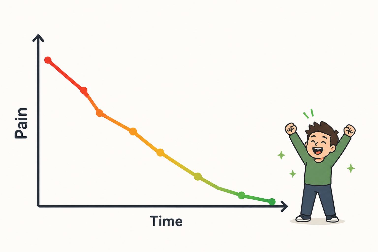
Scores creeping upward over time are often the first signal of trouble, well before anyone has named it. If your team was averaging 3 last quarter and is averaging 5 this quarter, something changed. The score gives you the conversation to have before it becomes a retention problem.
But the more interesting moment is the other direction. If your team consistently works on the problems the score surfaces — fixing noisy alerts, resolving recurring root causes, improving runbooks — you'll see scores drift lower over time. When you're regularly landing below 3, that's the goal. It means the system is working.
That's also the moment to ask yourself a question most teams skip: should we recalibrate?
For a legacy system that's stable and no longer under active development, a consistently low score might genuinely mean you're done. The oncall has reached a steady state and you can ease off the improvement effort. That's a win worth recognizing.
For systems that are actively being built and changed, a consistently low score is a different signal. It might mean your thresholds have grown too permissive for what the system has become, or that the team has adapted so well to the current load that the table no longer captures what "rough" actually feels like. In that case, revisit the calibration — not to manufacture pain, but to make sure the score still means something. A number that never moves stops being useful.
Start Simple, Calibrate as You Go
You don't need to get the thresholds perfect on day one. Use the example table above as a starting point, run it for one or two rotations, and let the team tell you where it feels off. If everyone is consistently using their +2 adjustment, your base thresholds are probably too conservative. If the ±2 rule is rarely used, the table is probably doing most of the work correctly.
The system is meant to be yours. Adapt the columns, adjust the thresholds, add a fourth input if your team has one that matters more. The value isn't in any specific set of numbers — it's in having a shared language for something that used to be impossible to talk about clearly.
To make calibration easier, we built an interactive calibrator where you set a single anchor value per column — the threshold that feels like Pain 5 — and it generates the full table automatically. When you're happy with it, copy the link and share it with your team.
Once you have that language, the conversation in your next retrospective looks a lot different. "How's oncall been lately?" "We had a rough stretch — averaged 6 over the last three rotations, mostly driven by off-hours pages from the payments service." Now you have something to work with.
Keep Your Oncall Handoffs in One Place
The weekly handoff is only as good as the information that gets passed along. If your outgoing engineer has to reconstruct what happened from memory, scattered chat threads, and half-finished tickets — context gets lost and the incoming engineer starts the week blind.
This is exactly where Opeego fits in. An Opeego session is a conversation that holds everything at once: the week's incident notes in the chat, open follow-up items as tasks with assignees and due dates, links to runbooks or dashboards as shared files. When the rotation changes, you hand off the session. The incoming engineer has the full picture without a 30-minute sync call.
The same session works for your regular pattern reviews — bring the team in, scroll back through the week's notes together, create tasks for the alerts that need tuning or the runbooks that need updating. Everything stays in one place instead of scattered across your wiki, your ticket tracker, and last week's Slack threads.